
Paul Sych, Graphic Designer, Typographer & Creative Director
Paul Sych, who has worked in experimental typographic design and development, is from Ontario, Canada. He started his own design agency, Faith, that creates bespoke typography, identity, motion and print works within the fashion, art and music spectrum. His work has appeared in more than 100 books and publications around the world, and he has earned extensive praise and recognition with more than 100 design awards in the past decade. His awards include his selection to judge competitions for the New York Type Directors Club, his recognition from the design journal Graphis as one of the “Ten Masters of Typography,” and a feature in Steven Heller’s book, “The Typography Idea Book: Inspiration from 50 Masters.” He was honored as a fellow for his work and research in design, art direction and typography by the Royal Society of Canada while teaching at York University and he designed the new logotype for Photobook Magazine.

“War”

"Typographic wall sculpture for Ravin Pillay Law"

"Futurezona"

"The Juggernaut"
What inspired you to pursue a career in design?
I was studying design at the Ontario College of Art and Design and Jazz in Toronto concurrently, and I decided that music was my path. Visual art was a close second to the dynamic world of jazz I was immersed in. I performed in various groups and hoped to create a career for myself.
At the time, my wife Gillian had been working for years in the printing industry heading up small art departments. She was offered a job at a new printer and accepted it on one condition: they would hire me as a production assistant and part-time delivery driver, a day job that would help keep my music studies going. Over the next few years, design was my main focus and I moved around various ad agencies and design firms. Those experiences prompted me to take the biggest risk of my career, I decided to go solo and start my own design practice.

"Head Games, Lush Magazine"

“Lush Magazine”

"Bad, Bad Beauty, Lush Magazine"
How did you begin your practice?
I first began by establishing a client base and shopped my portfolio to various clients and ad agencies both nationally and internationally. I landed a few commissions from a variety of advertising agencies and direct clients creating bespoke typography for clients such as; Coca-Cola, NBA, Ford, and Pepsi. One client led to the next and my practice began.
What made you want to start your agency, Faith?
I have always been curious about typography for reasons I can’t fully explain. Even as a high school student in art class, I was interested in typography. During my stints at previous design agencies, I always tried to re-invent typographic forms and to create new hybrids so that they would become more original and unique. This early exploration led to the foundation of my design agency where typography would play a crucial role alongside every design project that Faith is commissioned for. It slowly became our visual voice, which led to a host of publishers, film directors, producers, and creative directors hiring us to collaborate on specific projects.
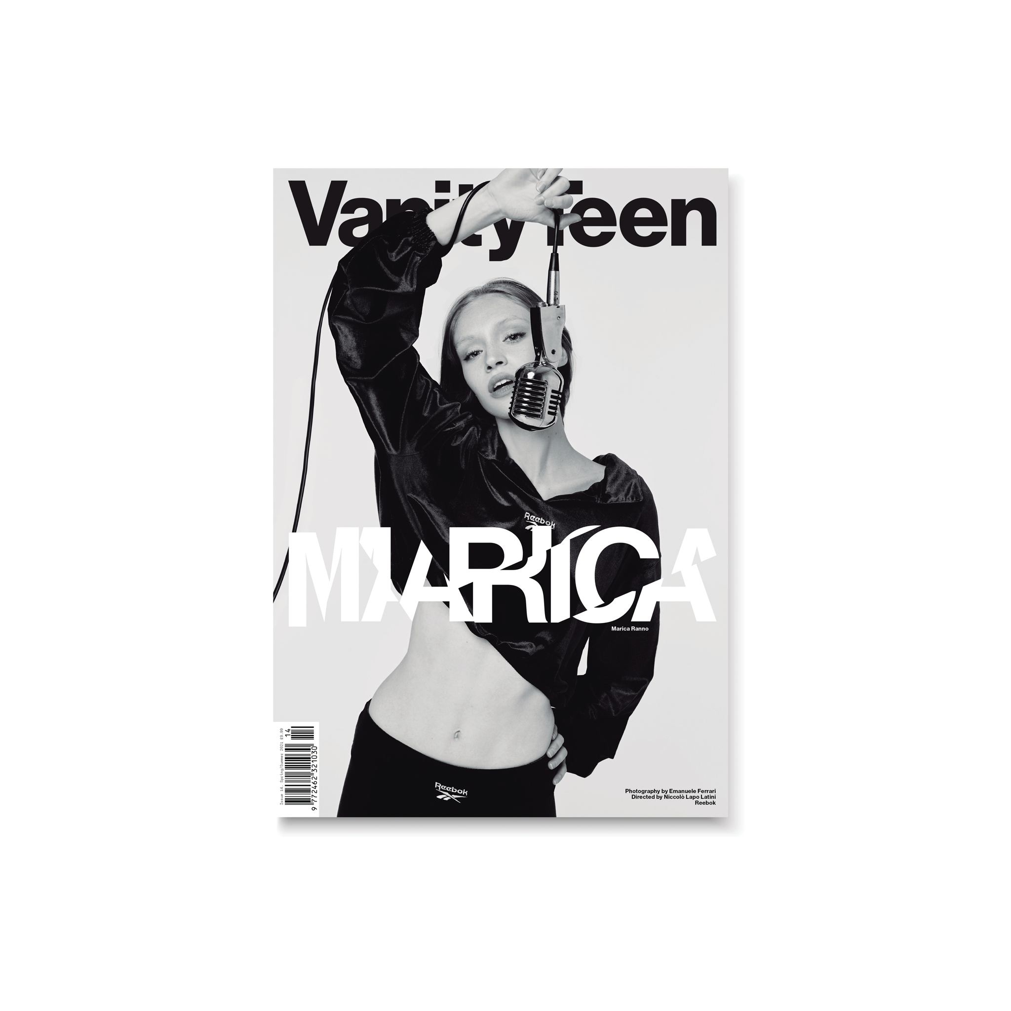
“Vanity Teen Magazine”

"Distant Solitude, Vanity Teen Magazine"

"New Hope, Vanity Teen Magazine"

"The Clouds Go Soft, Vanity Teen Magazine"
How has your career or design focus shifted throughout time?
My design focus has never wavered or shifted throughout the years. I’ve stood by the same principles when I started my design practice, which is simply to create works that are both exploratory/imaginative and that my appetite as a typographer is continually pushed and broadened through experimentation.
What inspires your work in typography and design?
Everything but design and typography. When I design a magazine spread for example I’m inspired by the photographer’s work. Without it, I can’t design the spread or the layout. I respond visually to their work and try my best to compliment theirs without disturbing the photographer’s initial vision. It’s a very collaborative process.

"Xotica, F.U. Magazine"

"Aura, F.U. Magazine"

"F.U. Magazine"
What does your design process look like, and how does it change project-to-project?
My process is rooted in research. Some projects start off from a simple pencil sketch while others begin as a mash-up of various forms and shapes in Adobe Illustrator. At times, a pencil sketch might resolve into an idea more efficiently than working on the computer and at other times the initial rough on a computer may resolve it. Creativity is like a muscle, the more you use it, the stronger you get.
When did you start teaching, and why?
I started teaching 20 years ago. My approach to teaching is a direct reflection of how I was taught, which allowed for more freedom, imagination, and ingenuity. These key elements are what I believe is the core of nurturing a design student. In addition to this, I stress that their visual voice is essential in design. They have limitless possibilities to experiment with what they design and create. In my case, the reason that I started teaching came from a colleague of mine at OCAD who had approached me and asked if I would teach part time and I agreed as long as the time would not conflict with the everyday needs of my design practice.

"Ethereal"
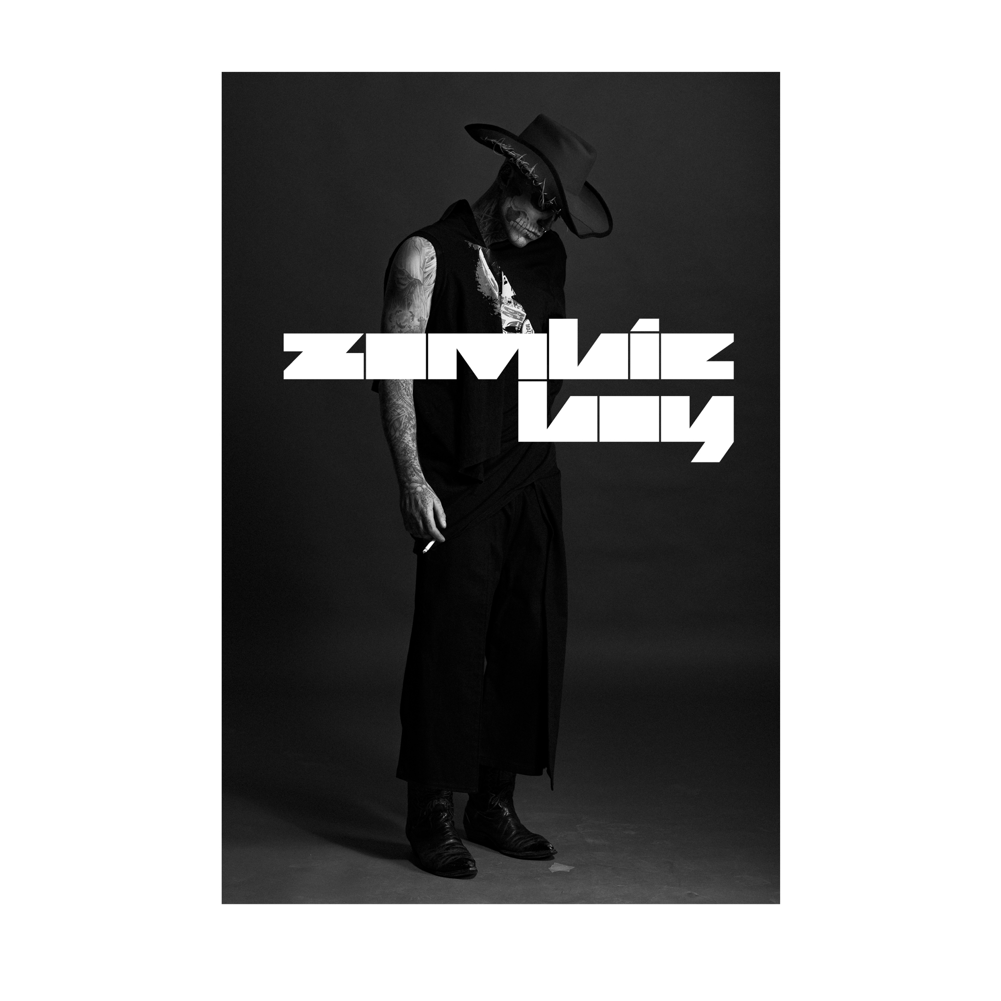
"Zombie Boy"

"Covergirl"

"Moxxy Jones"

"Salvador Dali Art & Fashion Exhibition"
Social Media.
Paul Sych: @paulsych
Agency: http://faith.ca


Interview by Flora Medina, Contributor, PhotoBook Magazine
All designs by Paul Sych